We
New logo
New Year, New Look
Hello, new logo

Important Notice
Dear friends
Since the establishment of Guangzhou Bailu Biotechnology Company, our logo has been the core element of brand identity, cahhying numerous stories and memories. It has witnessed our growth and your trust and support for our company. Every successful cooperation is the best interpretation of our company's brand value. Here, we sincerely thank you for your constant companionship and trust. It is your support that gives us the strength to keep moving forward.
Today, with infinite longing for the future and deep respect for the past, we solemnly declare:
Bailu Biology's brand logo is refreshed and unveiled

▼▼▼

From today on, we officially adopt the new logo, and the original logo will be gradually discontinued.
Meaning of the new logo design
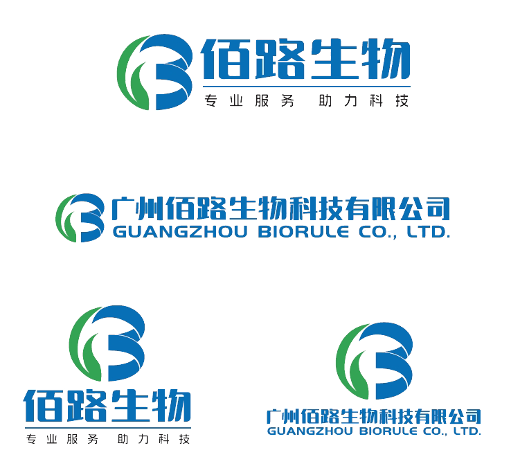
The design elements of LOG0 are derived from the first letter B of Bailu Biology. The letter B is abstracted and transformed, and the pattern looks like the letters L and B from left to right after the transformation. It cleverly integrates the first letter of Bailu Chinese and the overall shape is a connected ring.

Design concept and original intention
The overall logo is an abstract letter B, which represents the first letter of the name of Bailu Biology. This logo is modern, simple, and easy to recognize.
The logo shape resembles the number 13, symbolizing the integration of Guangzhou Bailu's glory into the Zhongyuan company family in 2013, and symbolizing the shared glory and growth process since 2013.
On the left side of the logo graphic is a sprouting leaf, symbolizing natural vitality and growth, reflecting Guangzhou Bailu's exploration of life sciences, respect for natural ecology, and pursuit of health and sustainable development in the field of biotechnology. On the right side of the graphic, there is a spiral upwards, symbolizing the company's continuous growth and upward momentum.
The overall shape of the logo is a circular ring, which represents the close connection and stable relationship between the company and its partners and customers. There is also an important theme hidden in the field of biotechnology, the cycle and sustainable development of life.
We are well aware of the importance of the logo to the company's brand image, so we have carefully considered every detail. The new logo adopts a modern design style, with a simple and stable overall color tone, and a stronger "Bai Lu style".

We believe that the new logo will bring new strategic opportunities and widespread recognition to the company, shape a stronger brand image, and enhance market competitiveness.
The new logo will be comprehensively updated on various printed materials, websites, promotional materials, social media, etc. of the company from today onwards. During this process, we hope you can provide understanding and support. If you have any questions or suggestions regarding this, please feel free to contact us at any time. Thank you for your continuous support and trust in Bailu Biology.
This is to announce.